Executive LinkedIn Banner Design Choices That Signal Authority
Your banner's first impression decides whether executives look closer or scroll past.
LinkedIn has crossed 1.3 billion members How to Build a Personal Brand on LinkedIn (2026 Guide). The platform stopped being a networking side project years ago and became the place where customers, investors, and future hires quietly decide what they think of a leader before any call gets scheduled How to Build a Personal Brand on LinkedIn (2026 Guide). Every element of an executive's LinkedIn banner — color, typography, imagery, text hierarchy, and whitespace — communicates a level of credibility and intentionality before a single word of content is read. A profile gets roughly 0.7 seconds to make its case, and the banner, sitting across nearly a third of the visible screen, is doing most of that work whether anyone planned for it to or not AI LinkedIn Banner Tools 2026: Free & Paid Options Compared.
Most people didn't plan for it. A blank space, or the default blue gradient LinkedIn hands out to anyone who skips this step, reads as a small confession: this person didn't think about how they'd be seen. Not a huge crime. But if you're an executive whose entire job is thinking several steps ahead, it's a strange place to stop thinking.
So this piece is a decoding exercise. Color, layout, image choice, the way text is stacked, even the empty space around it, all of it is already saying something about you before a visitor reads a single line of your About section. The rest of this article breaks down what each choice communicates, and which ones quietly work against the authority an executive is trying to build.
Technical constraints of the banner format and their impact on design decisions
Start with the shape of the canvas, because it dictates almost everything else. That ratio rewards a horizontal line of thinking: one message, moving left to right.
Mobile makes the constraint tighter still. On smaller screens, only the center 60% of the banner's width actually shows up. On smaller screens, content placed near the edges, like a logo or best line of copy, isn't visible for most people scrolling on their phone. The circular headshot sits over the bottom-left corner, so anything important parked there, a tagline, a call-to-action, a company mark, gets partially eaten. It's a bit like designing a billboard and then discovering someone parked a truck in front of the left third of it. The mobile crop cuts approximately 22% of the banner's height, which is why keeping important text and visual elements away from the bottom-left corner matters so much.
The fix isn't complicated, but it does require discipline: preview the design on desktop and mobile before publishing, every time. What looks sharp and confident at full width can look like a jumble once a third of it disappears. The format has roughly a 4:1 aspect ratio, and content that would read well in a square or portrait format becomes visually dense and hard to parse in this shape Personal Brand Building on LinkedIn: 2026 Guide |.... According to magier.com, the canonical dimensions for personal profile banners are 1,584×396 pixels, a wide, shallow canvas that rewards horizontal visual logic Personal Brand Building on LinkedIn: 2026 Guide |...
What color choices communicate about professional identity
Color is the fastest read on a banner, faster than any tagline, because eyes register a palette before they register words. The clearest authority move here is alignment: matching the banner to a company's actual brand colors. Brian Jameson of echogravity, for instance, used his company's orange for his display picture, paired with the company's offerings on the banner itself, tying his personal presence directly back to the business he represents. That kind of consistency doesn't happen by accident. It signals a founder who treats their personal brand as an extension of the company. The orange itself applies specifically to Brian Jameson's display picture, while the banner features the company's offerings https://www.supergrow.ai/blog/linkedin-personal-branding.
A strict two-color discipline recurs across strong examples. Vedika Bhaia and Angela Davis both run simple, two-color systems that carry through profile photo and banner alike. It's a small constraint that does a lot of work, because more than two dominant colors usually reads as design inexperience dressed up as creative range. Angela Davis's version of this discipline shows up as a turquoise-and-black brand match between her banner and profile photo https://www.magier.com/blog/linkedin-banner-examples. They think "no one proofed this."
Compare that to the default blue gradient LinkedIn ships out of the box, which signals nothing except that setup was skipped. Color is the most visible proxy for intentionality on the entire platform, so match the banner to whatever palette already shows up in your company's deck, website, or pitch materials. If no such palette exists yet, the absence signals a brand problem worth fixing before the banner gets touched. That's a brand problem hiding behind a banner problem, and it's worth solving first.
Typography and text hierarchy, how words are placed signals as much as what they say
One message. That's the rule, and most banners break it by trying to cram a headline, a subheadline, a call to action, and a slogan into a space built for one clean idea. When everything competes for the same visual weight, nothing wins, and the hierarchy just collapses into noise.
Look at how the strong examples actually rank their elements. Matt Barker leads with a value proposition ("Stop chasing clients, start attracting them"), names his audience directly ("For founders"), and drops his call-to-action into a clearly secondary position. Maxim Poulsen opens with a question that hits a pain point, follows with a line that sets expectations for what following him actually gets you, and again keeps the CTA subordinate. Maximilian Fleitmann, co-founder of magier, leads with a claim ("The only creative partner you need"), uses small tool icons as shorthand, and tucks a Trustpilot rating in as supporting proof rather than the headline. Three different banners, same underlying logic: rank your messages, don't stack them evenly. Maximilian Fleitmann is a co-founder of magier, alongside co-founder Sina Sadegh https://podim.org/brella-speaker/maximilian-fleitmann/.
That ranking has to appear in the type itself, not just the words. Hierarchy needs visible difference in size and weight; if the tagline and the CTA are rendered at the same size, the eye has no way to know which one matters more. A sharp tagline about what you actually do beats a job title every time, because the banner functions as a pitch, not a business card sitting in someone's wallet. It's a pitch.
Imagery choices and their implications for how you lead
What you choose to show in the frame says almost as much about how you lead as the words layered on top of it. Take Maximilian Fleitmann's banner, which includes actual mockups of design work rather than a stock illustration. A visitor gets a preview of the output before reading a word further, which is a much faster trust-builder than any claim written in prose.
Social proof works the same way when it's shown rather than told. Matt Barker places two testimonial screenshots in the top-left corner of his banner, letting other people's words do the credibility lifting instead of his own. It's proof you can see at a glance. Matt Barker's testimonial screenshots sit specifically in the top-left corner of his banner https://www.magier.com/blog/linkedin-banner-examples.
Then there's the question of what not to include. Generic landscapes, cityscapes, abstract swirls, the whole category of stock-photo filler, tell a visitor exactly nothing about who you are or who you serve. A visitor looking at a mountain range has no idea what you do for a living, and that's the whole problem with defaulting to scenery. Leaving the default grey banner untouched is, in fact, the single most common mistake executives make https://www.magier.com/blog/linkedin-banner-examples. Personality, on the other hand, tends to help rather than hurt. Angela Davis uses recurring AI-generated animal illustrations as a consistent brand element across her posts, and Maximilian Fleitmann keeps his banner from tipping into corporate stiffness with a simple name tag and pen illustration. That name tag reads simply as "Max," paired with the pen illustration, to keep the whole banner from feeling too corporate https://www.linkedin.com/posts/maximilian-fleitmann_50-linkedin-profile-banners-swipe-file-activity-7245342035052826625-ar4N. Approachability is a component of authority here. It's a component of it.
Whitespace and visual clarity, the authority signal most executives ignore
Empty space is the one almost nobody thinks about. The banner's roughly 4-to-1 aspect ratio means content that would read well in a square or portrait format becomes visually dense and hard to parse in this shape Personal Brand Building on LinkedIn: 2026 Guide |.... Whatever worked in another format doesn't automatically translate here, and pretending it does is how banners end up looking like a crowded subway map.
Overcrowding isn't just an aesthetic problem, it's a confidence problem. A banner trying to say everything at once ends up saying nothing with any real conviction, while a banner with room to breathe signals that its owner already knows what matters and isn't scrambling to prove it in every square inch. Every extra element, another color block, another icon, another line of text, taxes the attention the primary message needs to land.
There's a simple gut check for this. Picture a stranger looking at your banner for six seconds, which is roughly the judgment window a profile gets before someone decides whether to keep reading LinkedIn Personal Branding Guide 2026 (Get Noticed Fast). If you can't say what that person should walk away remembering, the banner's too full. Answer that question in one sentence, and the visual hierarchy usually sorts itself out along the way.
Banner design and the broader coherence of an executive's LinkedIn profile
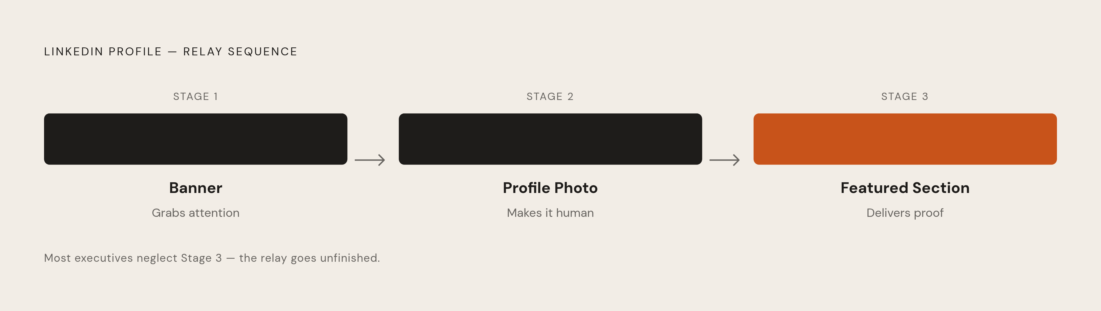
None of this works in isolation. Banner, profile photo, and featured section need to tell the same story, because a visitor doesn't experience them separately, they experience the whole profile in one glance. Angela Davis, Maxim Poulsen, and Brian Jameson all color-match their profile photo to their banner, which is a small technical choice that reads as a much bigger signal about how carefully someone manages their own presentation. Eric Nowoslawski is another executive whose featured section is cited as showing exactly why people choose to follow him https://www.supergrow.ai/blog/linkedin-personal-branding.
Think of the three pieces as a short relay race. The banner grabs attention first. The profile photo turns that attention into something human, a face instead of a logo. Then the featured section, where high-value posts or case studies get pinned, closes the loop by delivering actual proof of the claim the banner just made. Dropping the baton anywhere in that sequence stalls the whole handoff. This overall shift reflects a broader change in how LinkedIn functions for the C-suite, now that the platform has surpassed 1.3 billion members.
That also means a banner isn't a "set it once and forget it" asset. If a banner promises expertise in one lane but the content underneath it wanders somewhere else entirely, the mismatch reads as a quiet inconsistency, the kind that makes a visitor wonder what else might not add up. A sharp banner paired with a blank featured section and a stock-photo profile picture still lands as low effort overall, because the weakest link in that visual chain sets the ceiling for how credible the whole thing feels.
The banner's signals about a founder's broader content strategy and business intent
The stakes here are bigger than aesthetics. LinkedIn in 2026 has stretched well past lead generation into executive branding, talent attraction, fundraising conversations, M&A positioning, and general market perception, and the banner sits right at the entry point to all of it. It's the first thing that has to work before any of the rest gets a chance.
The numbers back up why this matters beyond vanity. Professionals running an active personal brand get 47% more inbound opportunities than those sitting on a dormant profile, and a well-built banner is the most visible early signal that a profile is actually active and intentional, not parked. Decision-makers, meanwhile, trust thought leadership over glossy marketing material by a wide margin, with 73% treating it as the more reliable read on someone's actual capability, which makes the banner the handshake that happens before any of that thought leadership ever gets read.
For founders hiring, imagery showing a team or a milestone moment does quiet pre-qualification work, giving a candidate a sense of culture before a job post even enters the picture. For founders raising money, a coherent, deliberate banner mirrors the same operational discipline investors are already screening for elsewhere in due diligence, while a blank or generic one is a small, avoidable point of friction at exactly the wrong moment. And for anyone building a content strategy on top of all this, a banner that nails the value proposition and names the audience sets the frame that every future post gets read through. Treat the banner less like a design errand and more like a positioning decision, because that's what it actually is: the first move in treating a personal brand like the business asset it's always been.
Sources
- LinkedIn Personal Branding Strategy: Your Playbook for 2026
- 20 LinkedIn Banner Examples and Free Templates for 2026 (+ Swipe File)
- AI LinkedIn Banner Tools 2026: Free & Paid Options Compared
- Personal Brand Building on LinkedIn: 2026 Guide |...
- LinkedIn Personal Branding Guide 2026 (Get Noticed Fast)
- Personal Brand Building on LinkedIn: 2026 Guide |...
- Personal Brand Building on LinkedIn: 2026 Guide |...