LinkedIn Carousel Post Examples for Executive Thought Leaders
Carousels get 585% more engagement than text posts when built with the right structure.

LinkedIn's own numbers tell a strange story: fewer than 1% of the platform's billion-plus users post weekly, and that sliver generates 9 billion impressions a week among them (LinkedIn, 2024). For an executive willing to actually show up, this is an empty auditorium with a microphone somebody left on.
Company pages, meanwhile, have gone quiet. Richard van der Blom's 2025 Algorithm InSights report, drawing on 1.8 million posts, found average reach per post on a company page has dropped to roughly 1.6%, down from around 7% in 2021. A company with 2,000 followers now reaches about 32 people per post. Personal profiles beat that by 5 to 10 times over. The algorithm has made its position clear: people trust people over logos. And the format that benefits most from that shift is the carousel, because it rewards exactly the behavior LinkedIn is built to notice. Buffer's analysis of over 52 million posts across more than 200,000 accounts put carousel engagement at 585% higher than text-only posts. A different format doing a different job.
What the engagement data actually says about how carousels work
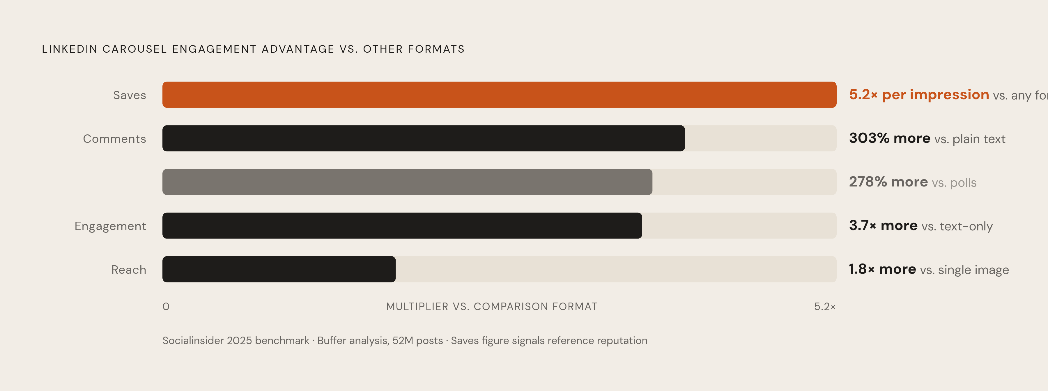
Socialinsider's 2025 benchmark study breaks the advantage into specific numbers, and the specifics matter more than the headline. Carousels post 3.7 times more engagement than text-only content, reach 1.8 times more accounts than single-image posts, and average a 36% completion rate when built well. Comments run 278% higher than polls and 303% higher than plain text posts. Saves per impression come in at 5.2 times higher than any other format on the platform.
That saves number is the one worth sitting with. A save means someone looked at a slide and decided they'd need it again later, which is the closest thing LinkedIn has to a bookmark on a real shelf. An executive racking up saves is quietly building a reference reputation: the person whose posts get kept rather than scrolled past and forgotten by lunch.
Completion rate matters for a different reason. Dwell time feeds the algorithm's read on quality, and a carousel that gets swiped all the way through signals attention held in a way a long text post skimmed in four seconds rarely will. So slide count and pacing aren't cosmetic. They're distribution levers, whether the executive posting realizes it or not.
None of this makes carousels the only format worth running. Video still pulls more comments plenty of the time, and a well-timed storytelling post in plain text can spike harder than anything else in the feed if it catches a nerve at the right moment. Treating carousels as the only lever is a mistake. A rotation works better: carousels once or twice a week, folded into a mix instead of standing alone.
The three-part structure that separates effective executive carousels from the rest
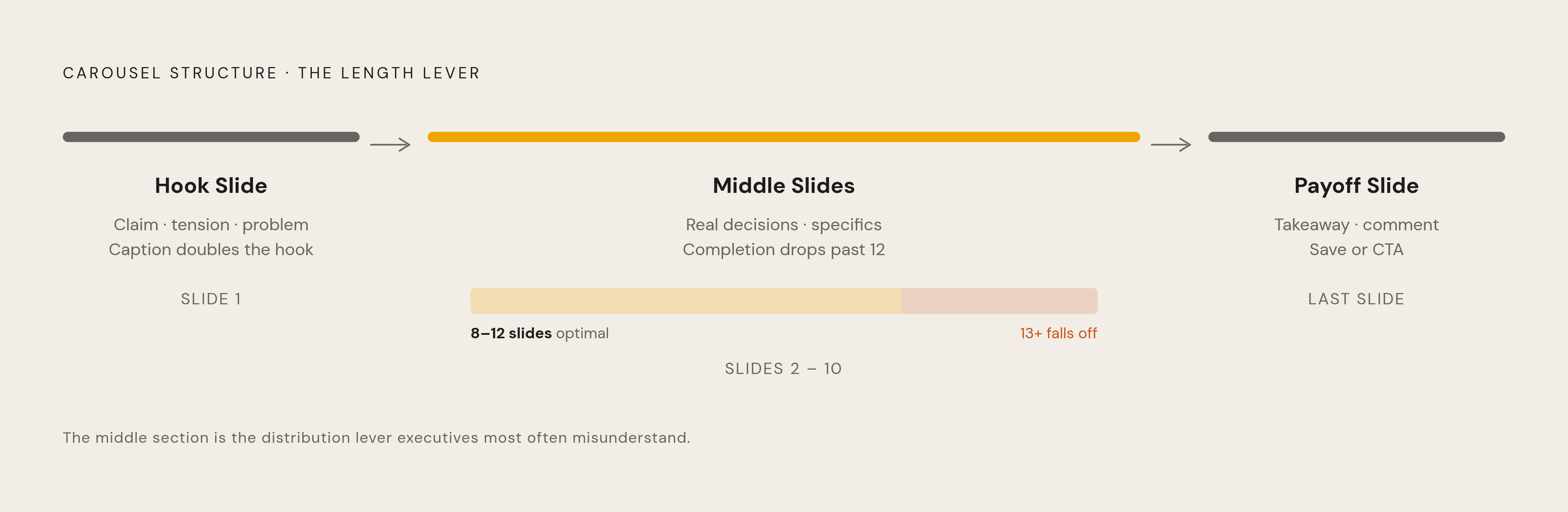
Look at any carousel that actually performs, and the shape underneath is almost always identical: a hook slide, a middle that does the work, and a payoff that lands. It's the same shape a good executive already uses to explain something in a boardroom. Orient the room, build the case, land the point.
The hook slide has one job: earning the swipe. Most executives get this backwards and write slide one like a title page, which is the single most common way a good carousel dies before it starts. A strong hook makes a claim, names a tension, or calls out a problem the reader already has but hasn't said out loud. The caption sitting above the carousel in the feed is a second hook, doing the same job in three to five lines before slide one even loads. Get both right and the stopping power stacks. Get either wrong and nobody reads past the thumbnail.
The middle, roughly slides two through eight or ten, is where the credibility actually sits. It needs real internal logic, each slide moving the argument or the story forward a step, not sideways. This is where an executive's advantage shows up plainly: real decisions, named situations, specifics nobody else could have written because nobody else lived them. Eight to twelve slides tends to hit the best balance of dwell time, completion, and saves; shorter tip carousels can work fine at five to seven. Push past twelve, though, and completion falls off a cliff.
The final slide is the payoff, and a good one does more than beg for a follow. It crystallizes the takeaway so the reader knows exactly what they just saved and why. Sometimes that's a summary line, sometimes a single next step, sometimes a direct question inviting a comment, sometimes a link to a newsletter. Whatever form it takes, the rule underneath every slide in between stays the same: each one should stand alone if screenshotted, and add up to more when read in order.
The content formats executives are best positioned to own in a carousel
Not every carousel format needs an executive behind it. These three do, which is exactly why they perform when an executive writes them and fall flat the moment a content generalist tries to fake the voice.
Lessons-learned carousels open with the mistake or the outcome on slide one, walk through the situation and what the executive actually believed at the time in the middle, then land the reframe at the end. What makes these work is honesty about a real cost, money, time, a bad hire, a bet that didn't pay off. That cost is what makes the lesson land as earned instead of lectured. Framing it as "what I got wrong about X" beats straight advice every time, because it signals actual skin in the game instead of borrowed wisdom.
Original framework carousels name the problem on slide one, introduce the framework's pieces in the middle, then show it applied to something real at the end. A named framework is inherently saveable and shareable; it hands the reader a tool and attaches that tool to the executive's name in the reader's head. The risk is the generic 2x2 matrix anyone with a whiteboard could've drawn in five minutes. A framework only earns its keep if it reflects real pattern recognition from the executive's own domain, not a repackaged version of something already circulating.
Career-tested insight carousels open with a counterintuitive claim, back it with evidence from the executive's own career (a specific company, a specific decision, a specific result), and close with the broader principle. Specificity is the whole engine. "At company X, facing Y, we did Z and got W" reads as an entirely different category of insight than "leaders should consider." An analysis of over 8,000 LinkedIn posts from C-level executives and founders found that specific, experience-grounded content consistently drove the strongest engagement. The job in a carousel is showing how an executive thinks, not just what they know.
Three carousel examples that show the structure working in practice
The financial modeling shortcuts carousel. A 15-slide reference deck on financial modeling shortcuts pulled in over 1,900 likes, more than 450 saves, and 2,300 newsletter signups tracked through a CTA slide link. It worked because of utility, not charm. Every slide held a standalone technique someone could use that afternoon. People saved it the way they'd save a recipe, not the way they'd like a joke. The pipeline matters here too: saves lead to repeat views, repeat views lead to CTA clicks, and the carousel keeps generating signups well after its first day in the feed.
The founder story arc. Slide one hooks on an outcome, a number, a surprising end-state. Slides two through five lay out the struggle or the starting condition, what things actually looked like before anything got better. Slides six through eight cover what changed and the specific decisions behind it. The final slide distills the lesson and points to a next step. Executives resist this format because it requires naming a low point, and that feels exposed. But the exposure is the entire mechanism. An audience that's lived something similar trusts the person willing to say it plainly far more than the one polishing every rough edge out of the story.
The myth vs. reality carousel. Slide one names a belief that's common in the executive's field and signals it's about to get challenged. Slides two through six run Myth against Reality, each pair backed by a quick bit of evidence or a named experience. The final slide asks a direct question, something like which of these surprised you. This format pulls comments rather than just likes, because contrarian claims give people something to argue with, and people like arguing. The executive's title does real work here too. A reframe only lands if the audience believes the person delivering it has actually earned the right to correct the record.
All three examples share the same skeleton underneath: a hook that's specific, a middle grounded in real experience, and a final slide that converts attention into something measurable, a save, a comment, a click.
The design and format decisions that affect whether a carousel gets read
These look like design questions on the surface. Underneath, they're readability and algorithm questions wearing a design costume.
Slide dimensions should run 1080x1080 for square or 1080x1350 for portrait, file size under 3 MB. Portrait eats more of the mobile screen, which lowers the odds of someone scrolling past without noticing. LinkedIn accepts PDFs, PPT and PPTX, DOC and DOCX files, converting all of them automatically into a swipeable carousel, so nobody needs design software sitting unused on their laptop to make one of these work.
Text density is where most executives overreach, and it's the mistake that kills more carousels than bad hooks do. Cap each slide at 40 to 60 words, body text no smaller than 24px, headings at 36px or bigger. Most people read this on a phone, and a slide that forces someone to zoom in loses them instantly. One idea per slide is the discipline that gets broken most often, usually because the instinct to add "just a bit more context" quietly kills the scannability that made the format worth using in the first place.
Visual consistency, same font, same color palette, same logo placement slide after slide, lowers the cognitive load on the reader, which keeps a thumb moving instead of pausing to figure out what changed. The final slide should look deliberately different from the rest: a visual cue that says this is the end, and there's something to do now.
And because each slide should hold up as a standalone image, screenshots become their own distribution channel. A clean, quotable slide travels on its own long after the original post has scrolled off everyone's feed.
One more thing worth stating plainly: the evidence consistently points to distinctiveness as a distribution advantage, which suggests the algorithm, or the audience, or both, can tell the difference between generic and genuine. Templated AI carousels look and sound like every other templated AI carousel. Distinctiveness, in voice, in the actual claim being made, in layout choices, is evidence a human sat down and wrote it.
Why executives who try to produce carousels consistently often can't, and what actually works
The bottleneck almost never sits where people assume. Executives don't run short on ideas. A career's worth of pattern recognition isn't a scarce resource. What's scarce is extraction, the actual work of pulling that pattern recognition out of someone's head and turning it into a structured, audience-ready sequence on a schedule that doesn't slip. A single carousel demands a hook decision, a sequencing decision, a distillation decision, and a design decision, four distinct skills stacked on top of each other. "Knowing the industry" isn't one of them.
Most people assume the fix is finding more time to write. Consistency beats brilliance most weeks, and the same analysis of 8,000 C-level LinkedIn posts found executives posting two to three times a week saw 57% more engagement per post than those posting just once weekly. Visibility builds with steady posting; real authority, the kind that changes how people describe an executive in a room, takes sustained effort over a much longer horizon. One great carousel dropped once a quarter doesn't compound. A decent carousel posted twice a week does.
That's exactly why the ghostwriting and strategic-partnership model around executive content exists. Turning what's in an executive's head into a recurring, well-built carousel is its own specialized job, closer to translation than writing. The version that works pairs the executive with a practitioner who can pull real experience out of a conversation and shape it into something that still sounds, reads, and argues like that specific person, with a voice no generic template could replicate.